Israeli Cuisine Festival & Awards
Israeli Cuisine Festival & Awards
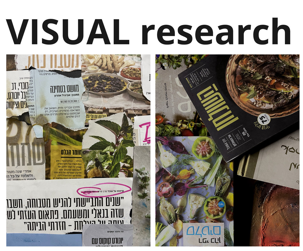
One of the greatest challenges in shaping the Israeli Cuisine Festival and Awards was defining what “Israeli cuisine” truly means — and finding a way to visually express it through the logo and overall visual identity. The design was inspired by a powerful quote from food writer Hila Alpert, who described the Israeli palate as “a palate in disorder.” This notion became the creative foundation for the brand’s visual language: a unique typographic structure built from a mix of handwritten letterforms, some of which evoke the flow of calligraphy intertwined with a fork’s motion — a fusion of free, instinctive gestures and precise, balanced refinements. The result is a visual identity that captures the very essence of Israeli cuisine: energetic, layered, unrestrained yet deeply rooted in craftsmanship and passion. It reflects a culture that celebrates bold flavors, diverse influences, improvisation, and a deep emotional connection to food — just as Israeli cooking itself does.


